Some months ago I got back into collecting Black Legion Chaos Space Marines. I used to play Warhammer 40K with a Black Legion army some 9-10 years ago, but over time sort drifted away from it. Did more show painting, played some fantasy, played some skirmish games, gennerally did not have much time for playing and suddenly my Black Legion was a thing of the past. The latest release of Warhammer 40K sparked my interest, I think the story of the Cicatrix Maledictum and how everything takes a turn for the worse is very interesting and the game rules themselves have been revised a LOT and turned into something much more sleek, fast paced and playable. I really felt like getting back into 40K, add to that the new version of Abaddon the Despoiler miniature and shortly after, the new releases of Chaos Space Marines and I suddenly found myself collecting Black Legion again…
Things have changed since 10 years ago, I paint differently and much faster, we have got new materials and paints. The miniatures are different and somewhat larger. We have got Contrast paints, which can really speed things up as well as give us an upportunity to paint in a more artistic and picturesque way. One thing that havent changed though is my aproach to painting Chaos Space marines… It is something dark and gritty, mad and visceral. These aren’t polished pretty boys, they are mad and ugly! These guys are crusty veterans of 10000 years of war! They hate everything and everybody and live only to bring down the false Emperor!
Here’s a small tutorial on how I paint Black Legion these days.
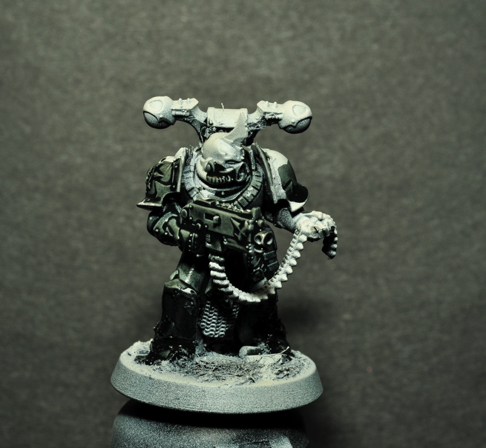
I have made a 5 man squad of Chaos Space Marines ready for paint. I always assemble my miniatures as much as possible for maximum coherency in my painting. I wouldn’t dream of leaving a bolter off of a soldier of the line as these, in order to paint the chest behind it, where I won’t see it anywhay. These need a coherent paint job that works at a distance and makes for a sense of drama and, with a few strokes tells the story of who these crazy old veterans are. I have added texture to their bases before undercoating, that is part of the coherent assembly… The bases have been smeared with a mixture of soil, sand and PVA glue. Small Juweela bricks, some skulls and a few gears from old clocks have been pushed into this goop. (the gears can be purchased online rather cheaply). A little bit of static grass has been added randomly to this, litterally by moistening a brush with thinned down PVA, then touching a bit of the grass and spreading it randomly on the base. I let some of the base material spread randomly on the miniatures as well, so they get a little dirty and fibrous…

I sprayed my marines black first and then hit them from above with Wraithbone, which is kind of a bone white, that is made to go with the Contrast paints. Normal white will do as well, but this one gives them a little more warmth. This is a so-called zenithal primer, it helps to define the vollumes of my figures and to establish a zenithal light source.
Now it is time for some Contrast Paint! I load some Contrast Wyldwood, some Contrast Black Templar and some Contrast Medium on my pallette. I shall use this to establish the colour of my warriors’ armor and scraps of clothing. I use a large brush for this, so I can get a fast and even coverage.

Now we have to work very fast! We are going to paint these two colours wet in wet, litterally mixing them on the miniature. I paint these figures one at a time for this step. I mixed a little bit of Contrast Medium into my black and brown paint, just to activate them. I painted the lower two thirds of my miniature with Black Templar, litterally just slapping it on with a large brush, I made sure that to rub the paint into all the recesses.
Now, while the Black Templar is still wet, I paint the rest with Wyldwood, letting the paints mix on the figure for a kind of gradual fade from one colour to the other! Do not be afraid to make this a mess, they are supposed to look messy. This deliberately messy way of painting works very well towards the crusty and dirty look of mad old veteran Chaos Space Marines that I am after here. While this paint is still wet, I use the Contrast medium in a rather unusual way: I add a little pure contrast medium to my figures in places where I want the paint to run off a little extra for a bit of highlighting, so I kind of erase my paint with Contrast medium where I want the most focus.


After the contrast mess, I paint my bases an earthy brown. I water this down to make sure that it goes in the recesses. I dont need much coverage on top of details because I am going to drybrush and wash these in later steps. While this earth colour is still wet I paint a rust-brown colour on the bricks and gears on the bases. It is not a problem to paint this first step on the bases while the Contrasts are still wet, if the colours mix a little it only adds to their dirty look, though you shouldn’t let it mix too much…
For the next step I drybrush the models with a cream colour. I drybrushed them heavily! all over both the figures and their bases. It is all about bringing details and textures out.

Notice how much all details and ornaments come to the fore after this drybrushing? You can save a lot of time this way! When painting units and armies, a technique like this can give you an impressive result on the gaming table in no time!
Next we give the base some love. I made 3 glazes, one of black, a green one and a brown glaze. I used P3 Bloodstone for the brown glaze, it has a nice rusty orange-brown colour. I left some of this undiluted on my pallette for the next step. First paint the black glaze all over the base, then add the green glaze in slightly random splashes, though make sure that you get some of the areas with static grass… Then add random splashes of brown and let all these colours run into each other and mix on the base. Finally add a little undiluted brown to the bricks and gears decorating the bases, so they get a slightly stronger colour than the rest. It is not a problem that this colour will run into what is already there, it can easily represent the rust running off the metal and soaking into the ground.

This wet in wet technique yields a very natural result after a couple of applications, so we’ll return to the bases later…
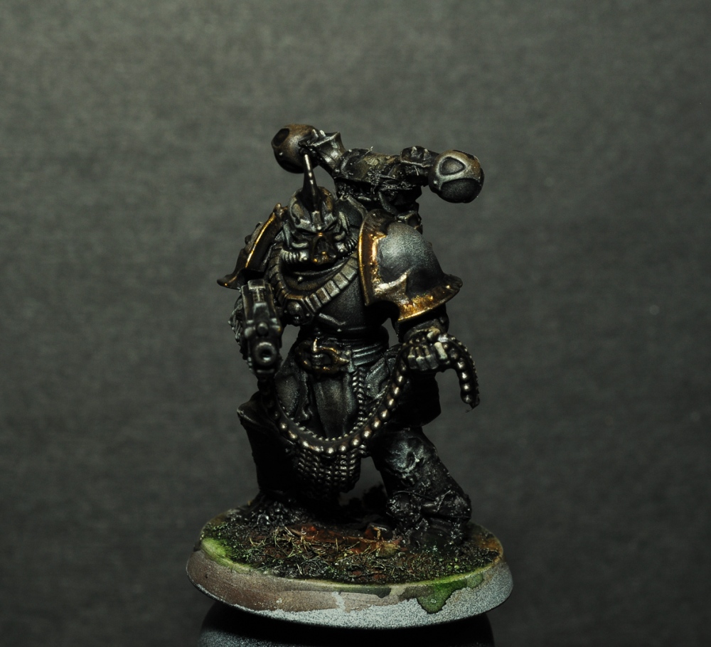
Now it is time for metals! I paint the decorative edges of the shoulderplates and a few select details a dark gold. I used P3 Blighted Gold for this, but I think any gold colour with a little black mixed in will give a similar result.

I painted the mechanical parts of the guns GW Leadbelcher, realizing that I wanted a more gunmetal colour, I mixed some black into this for some of them. The big heavy bolter was painted black first, then stipled/drybrushed with first the mix of Leadbelcher and black and then pure leadbelcher. Other details like blades, chains, chainmail bits and bullits got Leadbelcher as well.

Now it is time to shade the metals! When the metal colours were dry I gave all the metal parts a liberal coating of GW Agrax Earthshade. Don’t be shy with this, in order to get some convincing variations and shadows in the metal, i need the paint to pool and build up in places. This is not a realistic shading as per how the light reflects the parts, but it works quite well for a fast and expressive paint job like this. The wash dries matt, so it also works very well to make the metal non-reflective in the shadows and then we can build up reflectiveness by highlighting with metal colours. While I waited for this wash to dry, I drybrushed the bases again with my cream colour.

Now I start to highlight my metals. The first highlight is just a reapplication of the Blighted Gold and Leadbelcher that I started with. Don’t forget to mix a little black in the leadbelcher on some of the guns. The heavy bolter was stippled with Leadbelcher to keep the texture. I make these highlights where I think they will reflect the light and in places where I want focus. I make brush strokes in this highlighting, they create a bigger variety of reflections as well as to create a texture. These are crusty old veterans of 10000 years of war and their equipment should look the part.

I repeated the 3 glazes on my bases at this point. This second application of the glazes really helps the bases to look natural and coherrent. If you happen to hit the figures’ legs or loincloths with these glazes, just smear them out a little and leave it on, they do get dirty from the battlefield surrounding them!

Now I mix some silver into both my metal colours for another highlight. This second highlight should be in smaller, more focused areas, so you keep the mid tone. Leave a few areas after only one highlight, so you build up into light and focus. Actually omitting this step on some of your highlights will leave you with a more varied and detailed finish.

These are Black Legion! So I glaze their armor with a very thin black. Just to make it a little bit more black than what I got from the Contrast paints. This also helps to tie everything together.

This black glaze must be very thin, the effect is supposed to be a subtle darkening and tying together of the colours. I don’t do this all the time, but I use it as an adjustment where necessary.
Next I use washes and glazes for colour variations, this is where your figures really come to life. These black dudes need only a little bit of this, mainly the champion’s head, but I did find some other places as well. Figures of a more organic nature will benefit from a lot of this.

I used Reikland Fleshshade for the champion’s head. Skeleton Horde and Seraphim Sepia for horns and decorative skulls. Athonian Camoshade for deeper shadows and the back of the champion’s head. Volupus Pink around the champion’s eyes. The odd smear of Agrax Earthshade, Seraphim Sepia and Athonian Camoshade here and there on their armor and weapons. Some of these are Contrast paints, use the Contrast Medium for thinning and blending, they don’t always agree too well with water.

To finish off the bases I give then a very light drybrushing of my cream colour and on top of that, the static grass got a little bit of GW Balor Brown. I painted a little rust on their equipment, such as chainmail, blades and chains. The guns are to be well maintained, so little to no rust there! I did make some rust around the handle of the heavy bolter and the magazine. I make the rust by thinning down a redbrown colour, here I used P3 Umbral Umber, but any redbrown like dark rust or chokolate will do. This thinned down dark brown is floated into the recesses where rust will accumulate. I made a few thin runners on vertical surfaces as well. Once the dark brown is dry, repeat this with a lighter more orange-brown colour. For this second step I used P3 Bloodstone, same as on the bases. Any rusty orange-brown will do. The second step shall be in smaller areas, so you keep the dark surrounding it, let it build up where the rust will be thickest, hence the lighter colour. In areas where the rust wears off, it will only be a dark brown film.


Such rust deposits can also be made on the armor itself of such Chaos Space Marines. I chose not to do this on these guys, but once I start making some Plague Marines for my Black Legion Force, there will be rust all over!
Now it is time for the final super highlights and decals! The super highlights are small, tiny dots and lines of pure titanium white, other whites will do, but titanium is the best. I add these dots to the most prominent areas where they catch the light and also in areas around faces, where I want the most focus. This final highlight gives me a lot more definition where I want it. On the shoulder plates I stippled a little white on with a small D brush from Artis Opus, these are real good for such jobs. You can also take an old brush of maybe size 2 or 3 and cut the hairs around 3mm from the ferule and you can do something similar. Within this smear I get from the stippling I paint one solid dot of white and we get a fantastic play of light and reflection on the shoulder plate. I did this on some of the helmets as well. The metal parts get similar super highlights in pure silver. I didn’t so the stippling here though as the areas weren’t big enough for that. Because these figures are black you should do this sparingly, but these very bright highlights actually help us to percieve the figures as black because of the contrast. Just don’t overdo it.

While I have the white out, I paint my eye lenses and the plasma coils on my champion’s plasma gun white, in preparation for the next step.
When using decals or transfers if you will, start with a coating of gloss varnish where you want the decal. In this case the shoulder plate. When I apply the decals, I give them a little Micro Sol, this is a decal solution that softens them and help them conform to the surface. Once everything is dry, add another layer of gloss varnish on top of the decal, this should eleminate the decal film and make it look painted on. If you don’t want gloss shoulder plates, you can just give it some matt varnish in the end. I am going to airbrush matt varnish on these figures, so I will just leave the shoulders for that.
A nice glowing spot colour will really set these guys off. So I will paint their eye lenses a glowing orange. The champion has some equipment like his plasma gun and power axe which also will benefit from a little orange glow. I made a glaze of Vallejo Orange Fluo, which is, as the name suggests, slightly fluorescent. The coverage of this paint is terrible, so I have to build up the effect over several layers. That is also why I painted the eye lenses white; so the fluorescent orange will look clear and nice.

I glaze the surrounding area with orange as well as the eye lens itself. The same goes for the plasma coil of course. By glazing the surrounding area I build up the illusion of the light glowing. I also paint the edge of the shoulder plate that is closest to the eye and the inside front of the bolter, where it might reflect the light of the eyes. By including something outside the immediate glow effect, I make the light look much more convinving. I make sure that these glazes gather between the plates on the front of the plasma gun, while still glazing the rest of the area a little, in this way I create the feeling of energy seeping out between the plates. I build this up by glazing several times. For each glaze I make the area a little smaller, to fade it out. The light sources themselves are to be the most intense, so they get a little undilluted orange paint.

After 3-4 passes I was satisfied with the glow effect. This is actually the most simple way to make OSL and if you are new to such effects, this will be a good place to start.
For the last final touches, I highlighted a few of my glow effects with Createx Wicked Colors Sunburst, which is also fluorescent and a little brighter. I shaded the edges of the plasma coils and a couple of other details with red ink. I painted the rims of the bases black and airbrushed matt varnish all over the figures. I varnished these because there was too many different gloss and matt areas that needed to come a little more together. If you thin the matt varnish enough, you keep some of the differences between gloss and matt, just tying them a little more together. It also strengthens the surface a little bit, so they won’t get too worn by gaming. I painted a litle gloss varnish on the eye lenses, so they apear like glass.

And that’s it! I rather like to paint my Chaos Space Marines in this way. You can make the same in greens for Death Guard or reds for Wordbearers or World eaters.
Now off for painting a squad of Havocs and a 10 man squad of Chaos Marines. I have actually set the bits for the remaining 5 marines of this set aside for converting a squad of pretty darn mean Raptors…

I hope that you find this tutorial useful and inspiring! Do let me know in the coments, like and share! 😉
Until next time!
Never forget to have fun when you paint! 😀
-Kristian

A great tutorial! It is always great to see how other people use contrast paints. These look really nice and atmospheric. Also happy holidays!
LikeLiked by 1 person
Thanks! Yeah I like to see different people’s takes on this as well, always good with a new angle on it.
And happy holidays to you too my friend. 😊
LikeLike
That has to be one of the best ways I’ve seen to paint black legion.
I really don’t like the way that it’s so common to line highlight just inside the trim on armour plates and this way you get an interesting variation on the black without that.
I’ll be looking back at this I’m sure when I next work on my army and may even look to do some repaints.
LikeLiked by 1 person
Thanks, I am really happy that you like my method here. 😊 And you’re right, those fine lines just inside the trim of armor plates are certainly not the way to do it. I never liked those… 🤣
LikeLike
Just want to extend my thanks for this tutorial. I read and re-read this on a daily basis! youtube videos go by so quick, its nice to have a webpage to slowly read and absorb all the steps. I really appreciate this as a newcomer to the hobby. My CSM are looking awesome! Kudos!
LikeLiked by 1 person
Thank you so much for your nice words, I am very happy that your CSM are looking great as a result.😄 This really gives me motivation to carry on with my site here, after laying low for quite some time. Thank you!
LikeLike
Hey man. Always keep checking your page for new posts and this was certainly worth the wait! Lovely painting and easy to follow tutorial. Thank you!
LikeLiked by 1 person
Thank you. I am happy to hear that. 😊
LikeLike
Thank you so much for your lesson, it’s very inspiring! im sorry, please, write a list of colors!
LikeLike
Hi, I’m glad you found the tutorial inspiring. 🙂
The colors are:
GW contrast Wyldwood
GW contrast Black Templar
Vallejo Model Color Leather Brown
Vallejo Model Color Pale Sand
Black
P3 Bloodstone
Aerocolor Permanent Green
P3 Blighted Gold
GW Leadbelcher
GW Agrax Earthshade
Vallejo Model Air Silver
GW Reikland Fleshshade
GW Contrast Skeleton Horde
GW Seraphim Sepia
GW Athonian Camoshade
GW Cotrast Volupus Pink
GW Balor Brown
P3 Umbral Umber
Schmincke Heavy Body Titanium White
Vallejo Orange Fluo
Createx Wicked Colors Sunburst
These are all the paints as they apear in the article. You really don’t need to use the exact same colors, for instance my Titanium white can be substituded with any white. Any color that approximates what I’ve used will do… 🙂
LikeLike
You paint a lot different than I do, keep it up!
LikeLiked by 1 person
Thank you.
LikeLike